
13 min read
Why Online Ordering for Restaurants Is a Must
People ordering food from restaurants for takeout or delivery want the process to be: Convenient Easy Personal Customers want to: Find...
10 min read
The difference between restaurants that thrive on online ordering and those that struggle often comes down to user experience (UX) principles. These invisible rules shape how people move through your ordering flow and decide whether they place an order or abandon their cart.
Online orders now play a central role in restaurant revenue. Every tap, scroll, and click is an opportunity for your restaurant to increase its revenue. But if your digital experience feels confusing, slow, or frustrating, your guests will leave, and they might not come back.

In this guide, you’ll learn the essential UX principles that help you turn browsing into buying. We’ll look at practical ways to improve your user experience, increase conversion, and help users complete orders with less friction.
UX principles shape how people move through your ordering experience. They influence how quickly guests find what they want, how confident they feel while ordering, and whether they follow through or give up halfway.
At a basic level, UX principles describe how people think, browse, and act online. In restaurant ordering, they help guests move from menu to checkout without getting stuck or distracted.
A strong user experience starts with putting real people at the center of your design process. Instead of guessing what works, you pay attention to how users behave. You look at where they hesitate, where they tap, and where they leave.
If you skip this and design based on assumptions, conversion suffers. Your guests might struggle to find items, miss important details, or feel unsure at checkout. When there are enough points of friction, you’ll lose out on that order ultimately.
Restaurant ordering comes with its own challenges. Guests want speed, but they also want control. They expect clear choices, simple customization, and fast checkout, often while multitasking or standing in line.
That is where user interface (UI) matters. Your layout, buttons, and design elements need to support quick decisions. Your menu items should feel easy to scan, not buried in clutter. Every screen should help guests move through their tasks without confusion.
Great ordering experiences start with understanding how real people order food. This is where thoughtful UX work pays off. When you design around real behavior, you remove guesswork and build flows that feel natural.
You learn the most by watching real guests place orders in real situations. Simple user research, including conducting usability tests, shows you where people hesitate, what confuses them, and what slows them down.
These sessions often reveal small but costly pain points. Some examples include when guests want to customize their order, but they can’t find modifiers, when pickup times feel unclear, or when they leave when fees appear late in the process.
Pay attention to how real users move through your ordering flow, not what they say afterward. Watch where they pause and notice when they scroll back. Those moments tell you more than surveys alone.
When someone opens your ordering page, they already have a goal. They want food, and they want it without friction. Your role is to remove obstacles so guests can complete tasks quickly and confidently.
Every screen should support forward movement. If people need to hunt for buttons or rethink their choices, that can be a negative issue. Clear categories, obvious next steps, and simple customization help reduce drop-offs.
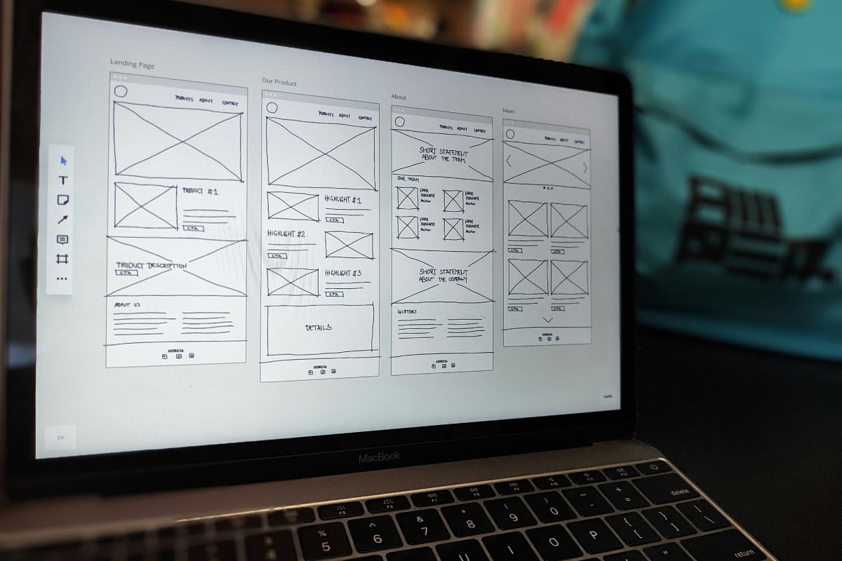
Start with a few core principles. Keep your menus readable, avoid showing too many options at once and use progressive disclosure so advanced choices appear only when relevant. This manages cognitive load and keeps attention on the order.
On top of that, structure your screens so each step feels purposeful, and group-related choices together. Also, make primary actions obvious, and use simple design elements to guide the eye forward.

Visual design is more than making your site look nice. In online ordering, it guides people to the factors that matter most.
Visual hierarchy tells guests what to notice first, second, and third. In restaurant ordering, this guides attention to popular dishes, combo deals, or high-margin add-ons.
Size, color, contrast, and spacing separate primary actions from secondary options. Use bold headings or highlighted sections for must-see items and allow whitespace to prevent screens from feeling crowded.
Be careful not to overdo it. If you highlight too many popular dishes or chef specials at once, everything starts blending together.
Guests can’t tell what’s important, and the menu feels cluttered. With this in mind, pick the few key items you want to draw attention to, and let everything else stay secondary. This makes choices clear and allows guests to act confidently without feeling overwhelmed.
Avoid unnecessary elements that compete for attention or confuse scanning. When the hierarchy is clear, guests move naturally through the menu, understand the most important choices, and are more likely to complete their orders.
Menus are the heart of your online ordering interface. How you group menu items should match both guest expectations and your restaurant’s style. A quick-service restaurant (QSR) or casual-dining restaurant often benefits from straightforward categories like appetizers, mains, and sides. This enables guests to scan quickly and make choices without thinking too much.
Consistent typography, spacing, and color make scanning easier. Clear pricing reduces cognitive effort, and thoughtful layout can suggest extras like drinks or sides, helping increase ticket size without pressuring guests.
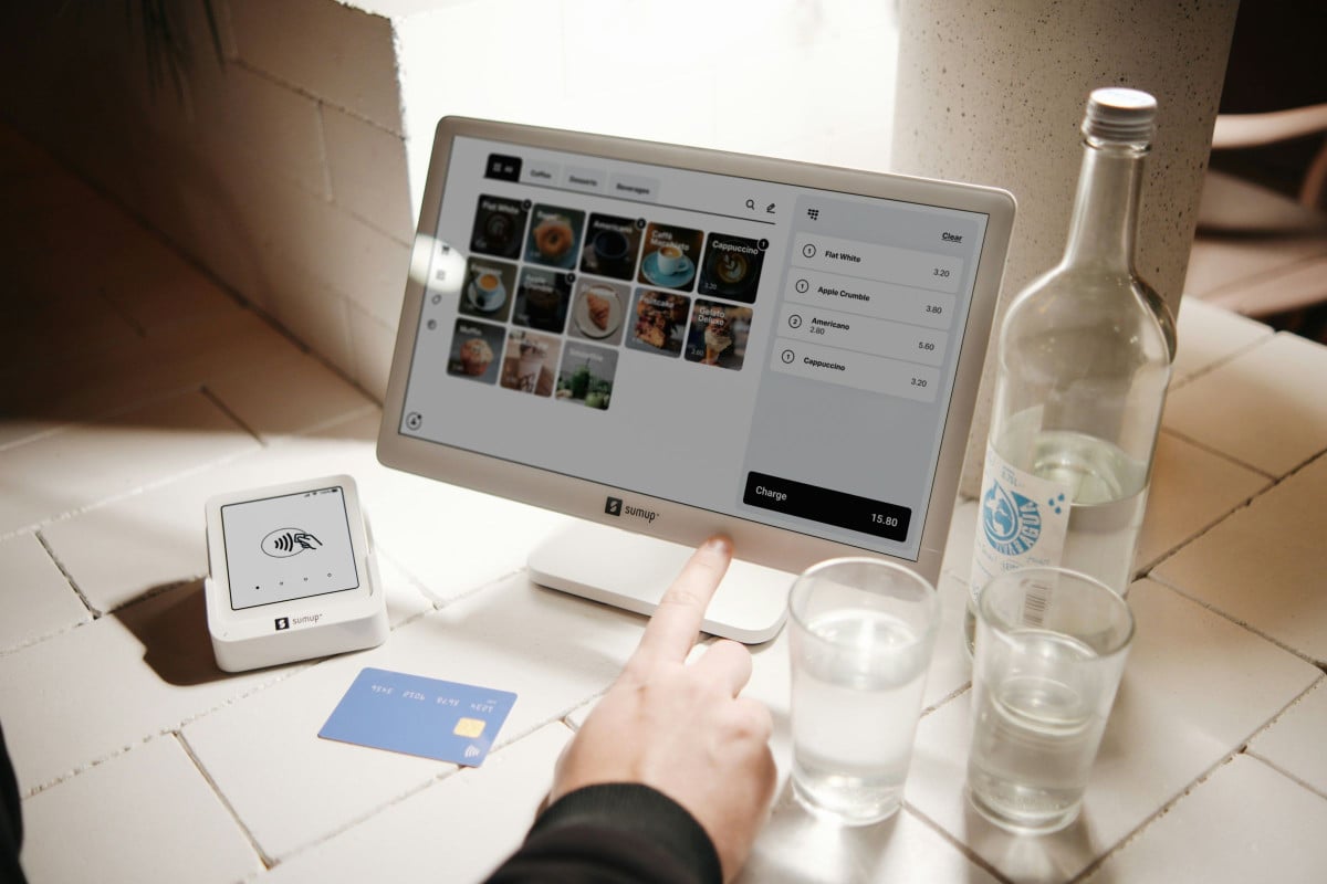
Interactive elements like buttons, checkboxes, and forms control how guests move through your ordering flow. Place buttons where people look and make them distinct visually. Forms should be simple and only ask for essential information, reducing the chance of errors.
Immediate user feedback after an action reassures guests that the system recognized their choice, whether adding an item, changing a quantity, or selecting delivery options. This feedback usually comes in the form of subtle animations, color changes, or confirmations.
The goal is to create a user flow that feels coherent, with each step presented logically and predictably. This way, you let your guests focus on their choices rather than spend their energy on figuring out the interface.
When it comes to checkout, here’s the golden rule: The fewer the steps, the better. If someone wants to order food, asking them to create an account first is already asking too much.
Guest checkout removes that extra step. Digital wallets help as well, especially for people ordering on their phones who don’t want to type in card details.
This is usually the point where people decide whether to finish their order or give up. Long forms and unnecessary fields make that decision harder than it needs to be.
Keep only what’s required to place the order. The less work guests have to do, the easier it is for them to complete the purchase.

It’s easier to flag issues as they happen than to surface them at the end. If an item is missing or entered incorrectly, like an apartment number or delivery address, let guests know right away.
When errors do come up, keep the message clear and direct. Say exactly what needs fixing, without technical language or vague prompts. For example, if an address falls outside your service area, show that immediately so guests don’t waste time filling out the rest of the form.
Clear, timely feedback allows people to stay on track. They know what went wrong, what to fix, and can move forward without stopping to guess.
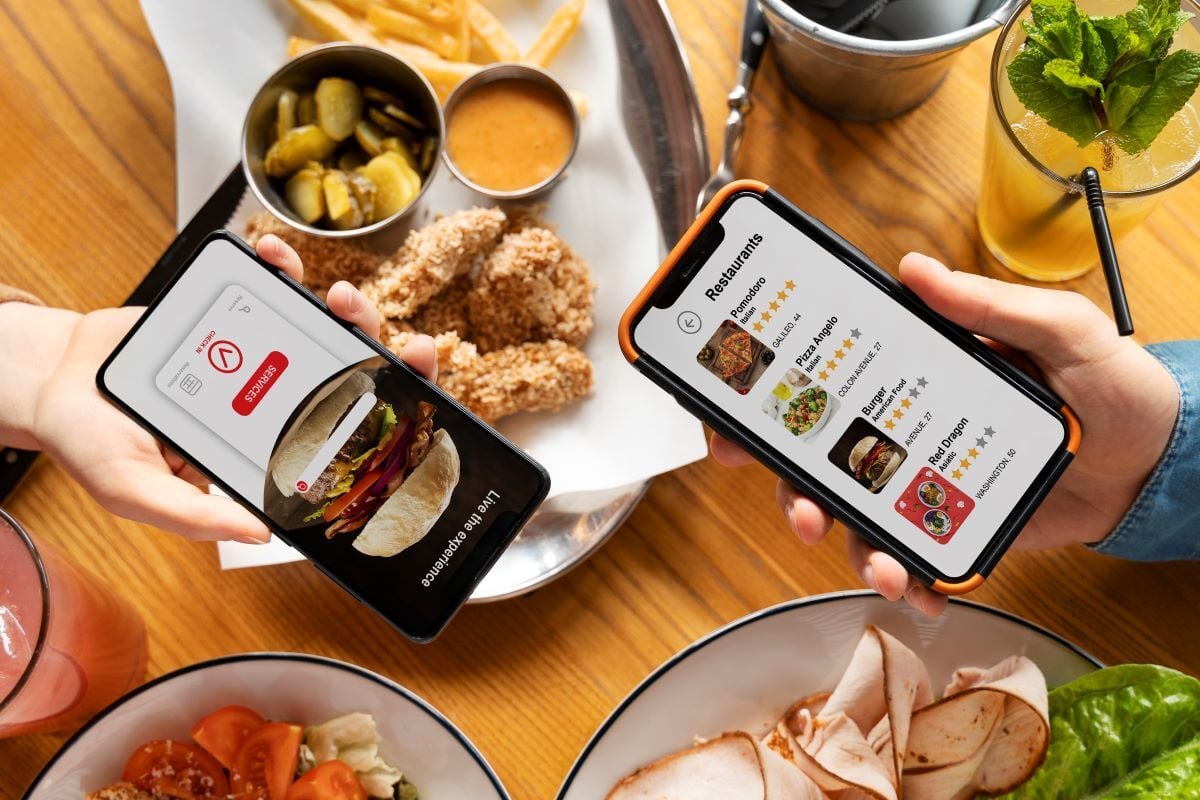
Most guests place orders on their phones, so mobile can’t be an afterthought. Buttons need to be easy to tap with one hand, and pages should load quickly, even on mobile devices.
On smaller screens, what matters most should stay visible. Essentials like the cart total and “Place Order” button shouldn’t disappear as guests scroll. If people have to hunt for basic actions, they’re more likely to leave and use a delivery app instead.
Mobile ordering often happens while people are out, multitasking, or short on time. Keep layouts simple and focused. Make interactions comfortable for thumbs and avoid clutter. When the experience feels smooth on a small screen, guests are far more likely to complete their order right there.
When your guests are building an order, they might click the wrong button accidentally or choose an ingredient they don't want. Keep them from getting frustrated by giving them clear ways to undo those actions or edit their cart at any stage.
Guests change their minds while ordering. Someone might add a fried chicken sandwich, then realize they want the grilled version. They shouldn’t have to start over to make that change.
An edit option in the cart makes it easy to swap items, remove an item, or adjust quantities. There should also be an obvious way to go back and revisit earlier choices without losing everything already added.
When guests know they can fix small mistakes or tweak their order along the way, they feel more comfortable browsing and trying different options. The process feels flexible instead of rigid, which makes customizing meals easy.
Transparency matters, especially around pricing. Hidden fees are one of the quickest ways to lose someone halfway through an order. Guests want to see delivery times, service charges, and totals early, not as a surprise at the final screen.
Showing the full cost upfront allows people to decide before they’ve invested too much time. If the total at checkout matches what they’ve been seeing all along, there’s no second-guessing.
Small details also help build confidence, like visible contact information and familiar security icons. Together, these cues make the experience feel legitimate and straightforward.

A good ordering site works for everyone, including guests with visual impairments. High-contrast text, readable fonts, and screen reader support make it possible for more people to navigate the menu and place an order.
Making the site accessible often improves the experience for everyone. Bigger buttons, clear labels, and simple layouts help people order outside in bright sunlight or in low-light conditions.
Inclusive design removes barriers that could stop someone from completing an order. Thinking about accessibility from the start makes the site easier to use for all guests and shows that the restaurant welcomes every customer. Small changes can make a big difference in who can order and how smoothly they do it.
Managing cognitive load is about making the mental work of ordering as light as possible. If your menu feels like a puzzle your guests have to solve, they will likely give up.
A clear interface makes it easy for guests to find what they want without feeling overwhelmed. A long list of 60 appetizers, for example, can make choices feel harder than they need to be.
A simple layout reduces the mental effort required to order. When pages follow a predictable structure, guests can focus on picking their food instead of figuring out the website. Smooth navigation keeps the process quick and straightforward, so ordering stays enjoyable from start to finish.
Consistency makes navigating a menu feel effortless. When the "Back" button or cart icon stays in the same spot on every page, guests don’t have to pause and figure out where to go next. Familiar patterns make the whole process feel natural.
Small changes, like a checkout button shifting color or size between screens, can be distracting. Even tiny inconsistencies can break focus and slow someone down.
When the interface behaves predictably, guests can move through their order without having to think about how it works. The design fades into the background, letting people concentrate on choosing their meal instead of navigating the site.
Clear feedback enables guests to know what’s happening at every step. If someone taps “Add to Cart” and nothing changes on screen, they might wonder if the action went through or if they need to tap again.
Small signals, like a brief animation, a checkmark, or a confirmation message, make it obvious that the action worked. Showing how far along someone is in the checkout process is also beneficial, so they don’t feel stuck or unsure how many steps remain.
When the interface responds quickly, guests can move through their order smoothly. Seeing what happens after each action keeps them oriented and in control, so placing an order feels straightforward from start to finish.
The ultimate goal of using these frameworks is to turn more of your website visitors into paying guests. When you move beyond theory and look at actual results, it becomes clear how much a few intentional changes can impact your bottom line.
Many UX improvements in the food industry focus on removing obstacles that stop guests from finishing an order. A common approach is keeping the “Add to Bag” button visible while someone scrolls through a long menu, so they don’t have to hunt for it. These practices reflect how people use digital ordering when they’re in a hurry.
Another example is moving from a multi-step checkout to a single-page flow. This simplifies the process and keeps guests from abandoning their carts out of frustration.
Restaurants that follow these patterns usually see more completed orders. When the experience is straightforward and predictable, guests can focus on picking their food rather than figuring out the website. Aligning the site with what people expect makes it easier for them to place an order.

You don’t need a complete redesign to see results for your restaurant. Small, practical changes can make a big difference. Improving your site’s loading speed is one example: Even a short delay can frustrate guests and slow down orders.
It’s also beneficial to get regular feedback or run simple usability tests with people who haven’t used your site before. Fresh eyes often catch roadblocks that the team working on the project might overlook.
Making small, ongoing improvements based on real guest behavior keeps your ordering platform running smoothly. When updates reflect how people navigate the site, the process stays easy to use, and guests are more likely to complete their orders. Over time, these small tweaks add up to a more reliable and profitable experience.
Here are some frequently asked questions about how UX design can boost online orders for restaurants. Find answers to common concerns and tips to improve your customers’ ordering experience.
Menus that are easy to browse, clear dish descriptions, high-quality photos, and visible pricing have the biggest impact. Quick-loading pages and a smooth, mobile-friendly checkout make it simple for customers to place orders without frustration.
Good UX anticipates common pain points: Showing delivery fees upfront, offering multiple payment options, enabling guest checkout, and keeping forms short. When ordering is straightforward and transparent, customers are far less likely to abandon their cart.
Yes, even small changes like highlighting popular dishes, improving menu readability, or simplifying the checkout process can lead to more completed orders. These improvements make the site easier to use and create a sticky experience that encourages guests to return. In the restaurant industry, every second saved and every friction point removed can boost revenue directly.
UX principles, from user-centered design and visual hierarchy to managing cognitive load, influence whether guests complete their orders or abandon their carts. Restaurants that apply these principles systematically not only capture more orders but also gain a competitive edge in today’s digital landscape.
As guest expectations for seamless online experiences continue to rise, mastering UX design is now essential for driving revenue growth. Start by auditing your current ordering experience, identifying friction points, and prioritizing improvements based on conversion data.
Our online ordering solutions make it easier for you to implement UX improvements and create a smoother, more engaging ordering journey for your guests. Schedule your free demo now.

13 min read
People ordering food from restaurants for takeout or delivery want the process to be: Convenient Easy Personal Customers want to: Find...
12 min read
Restaurant booking apps and online reservations have transformed the restaurant industry. What was once managed through handwritten logs and phone...
15 min read
In the high-labor, low-margin restaurant industry, every screen and piece of tech your restaurant uses needs to work more efficiently.